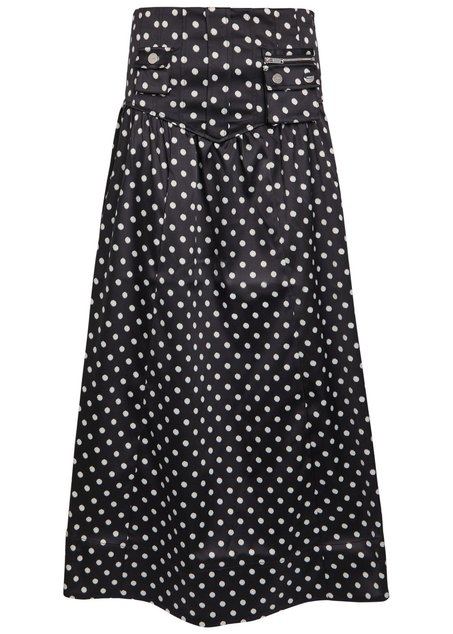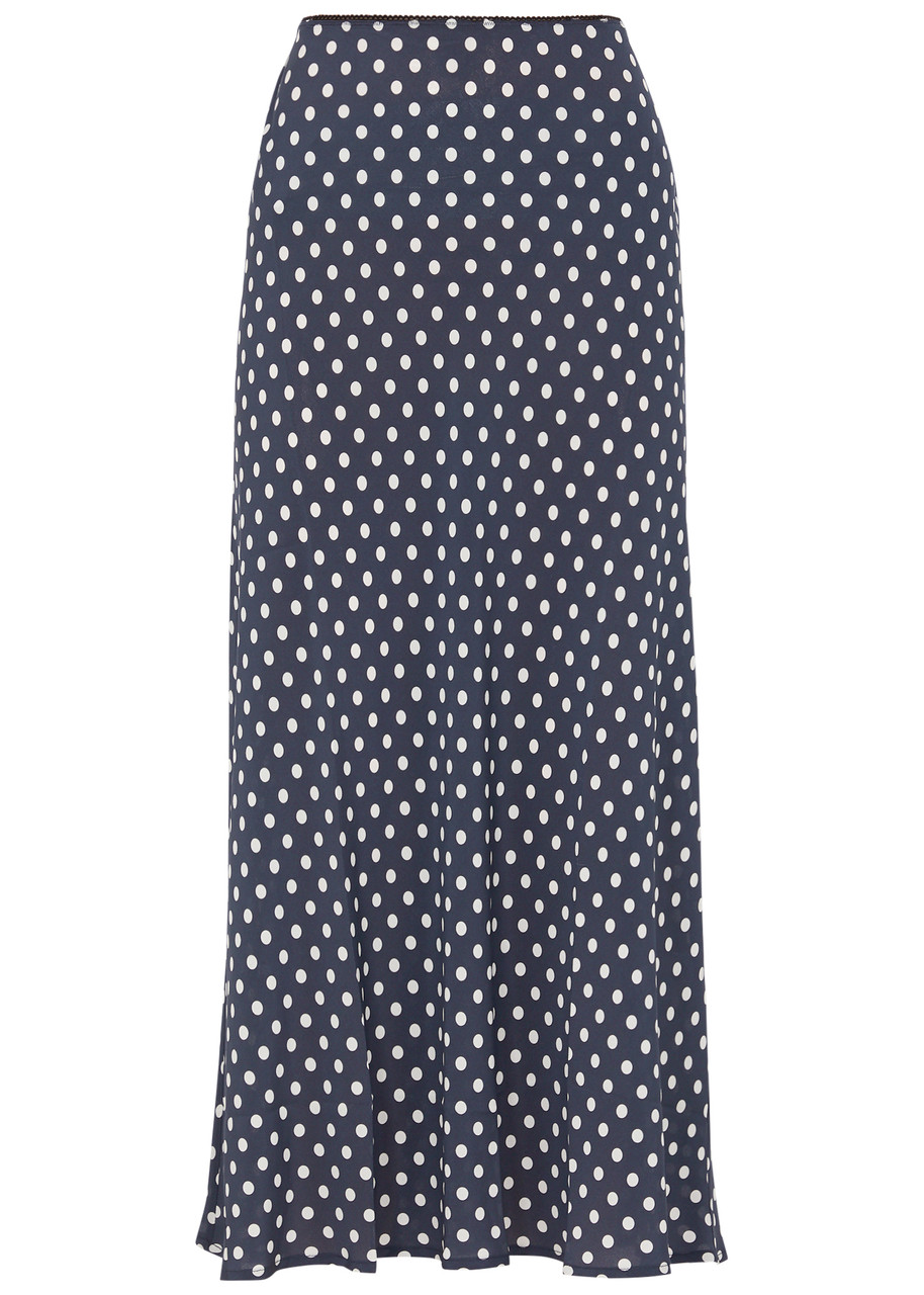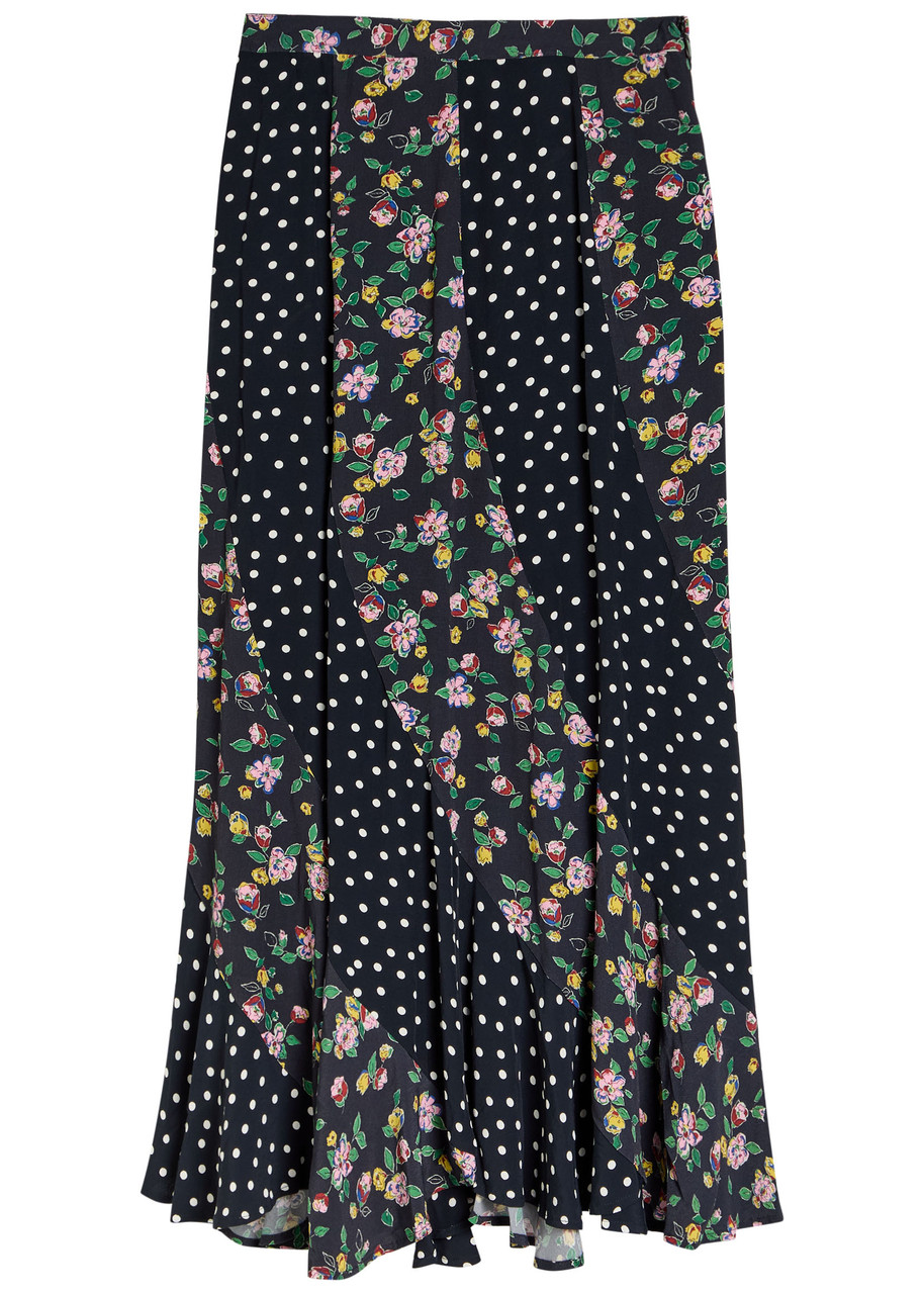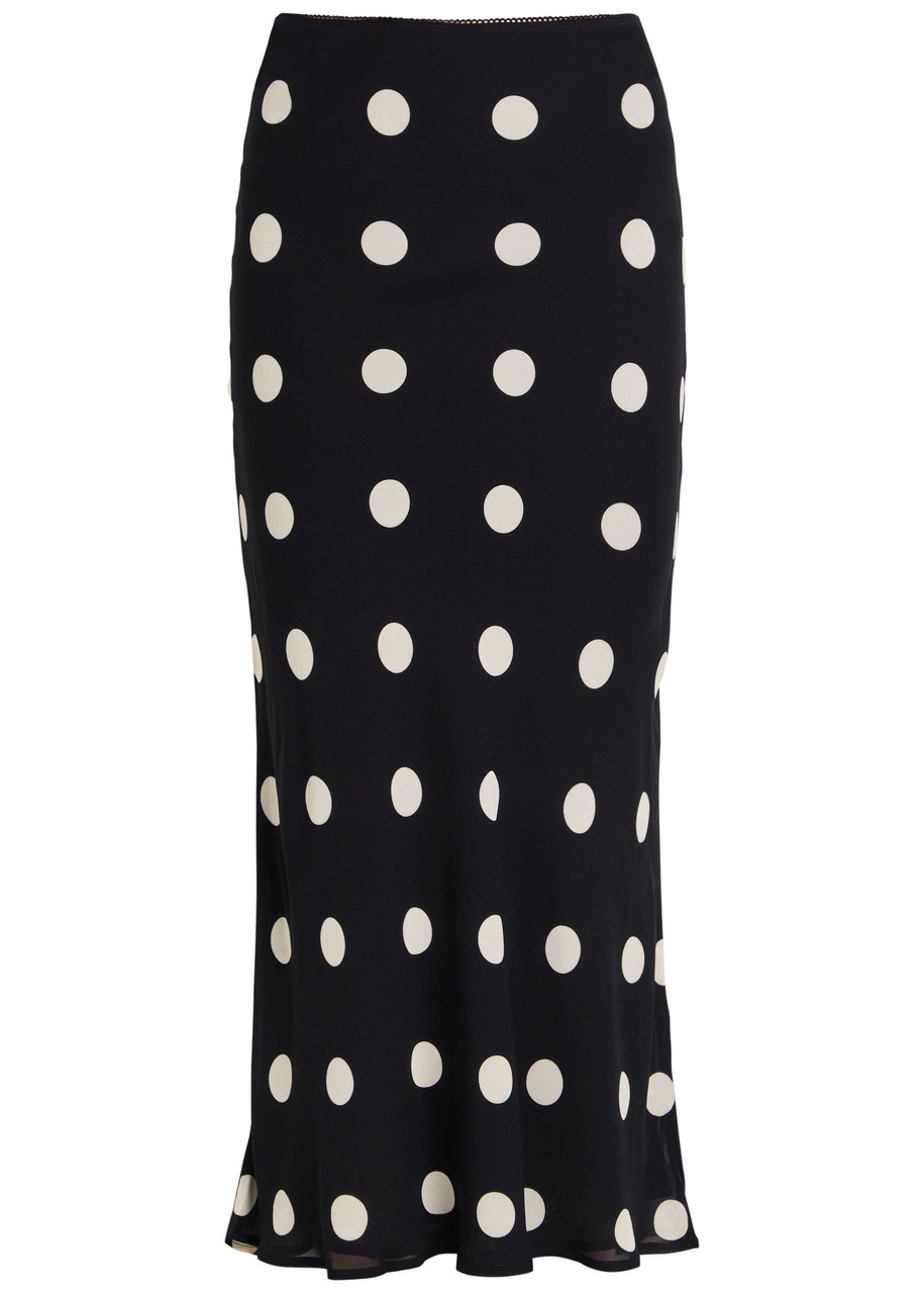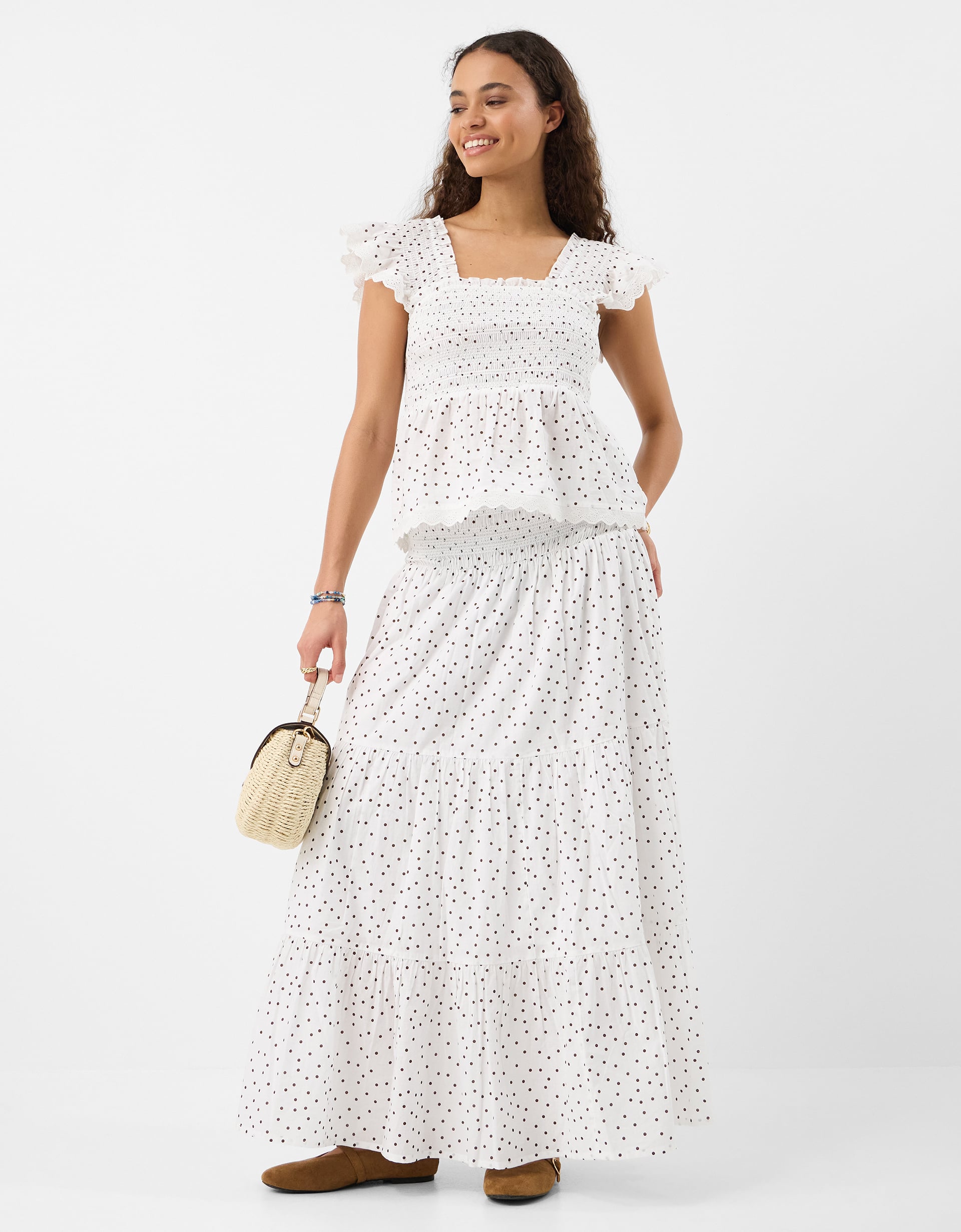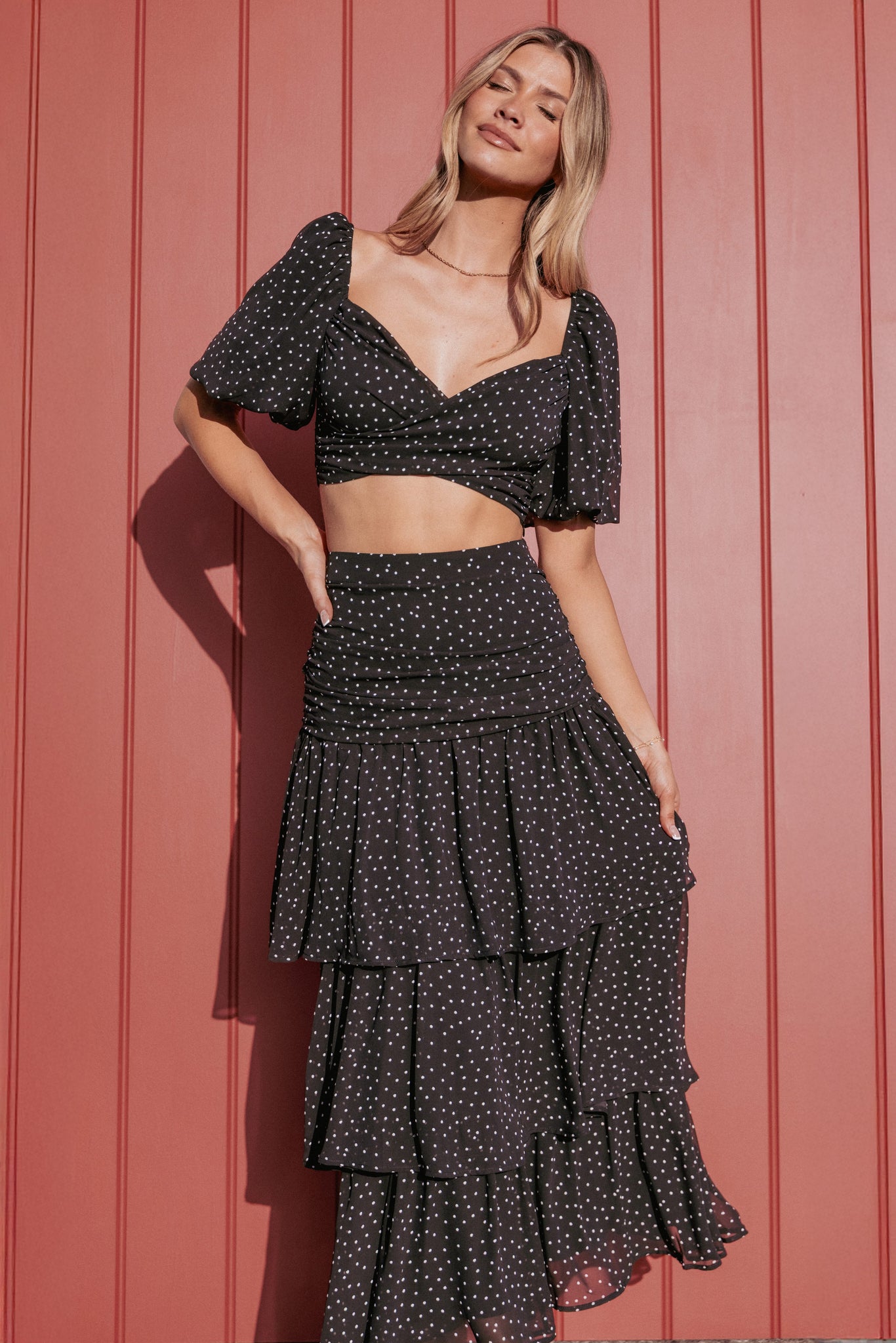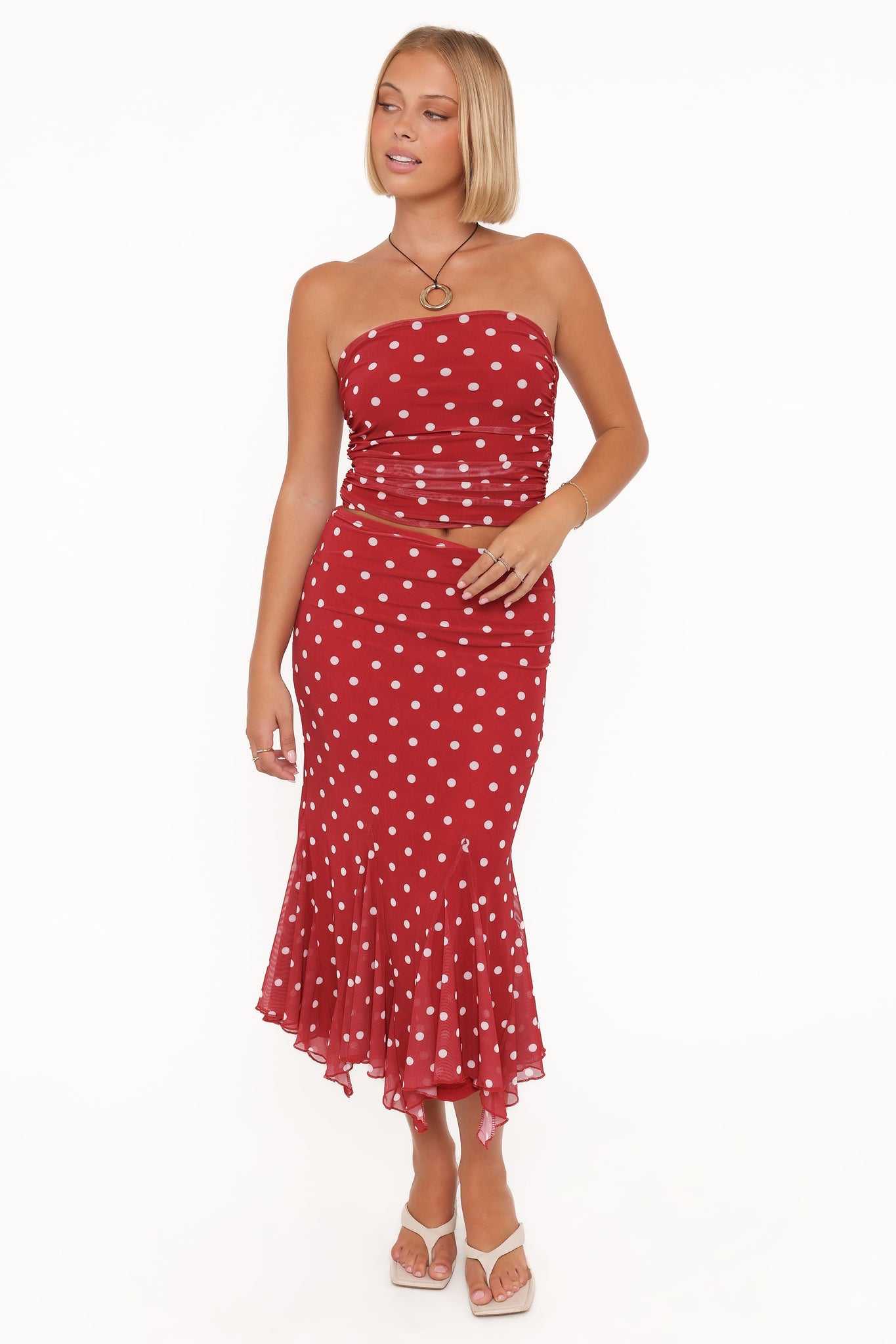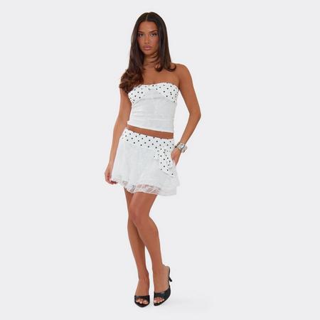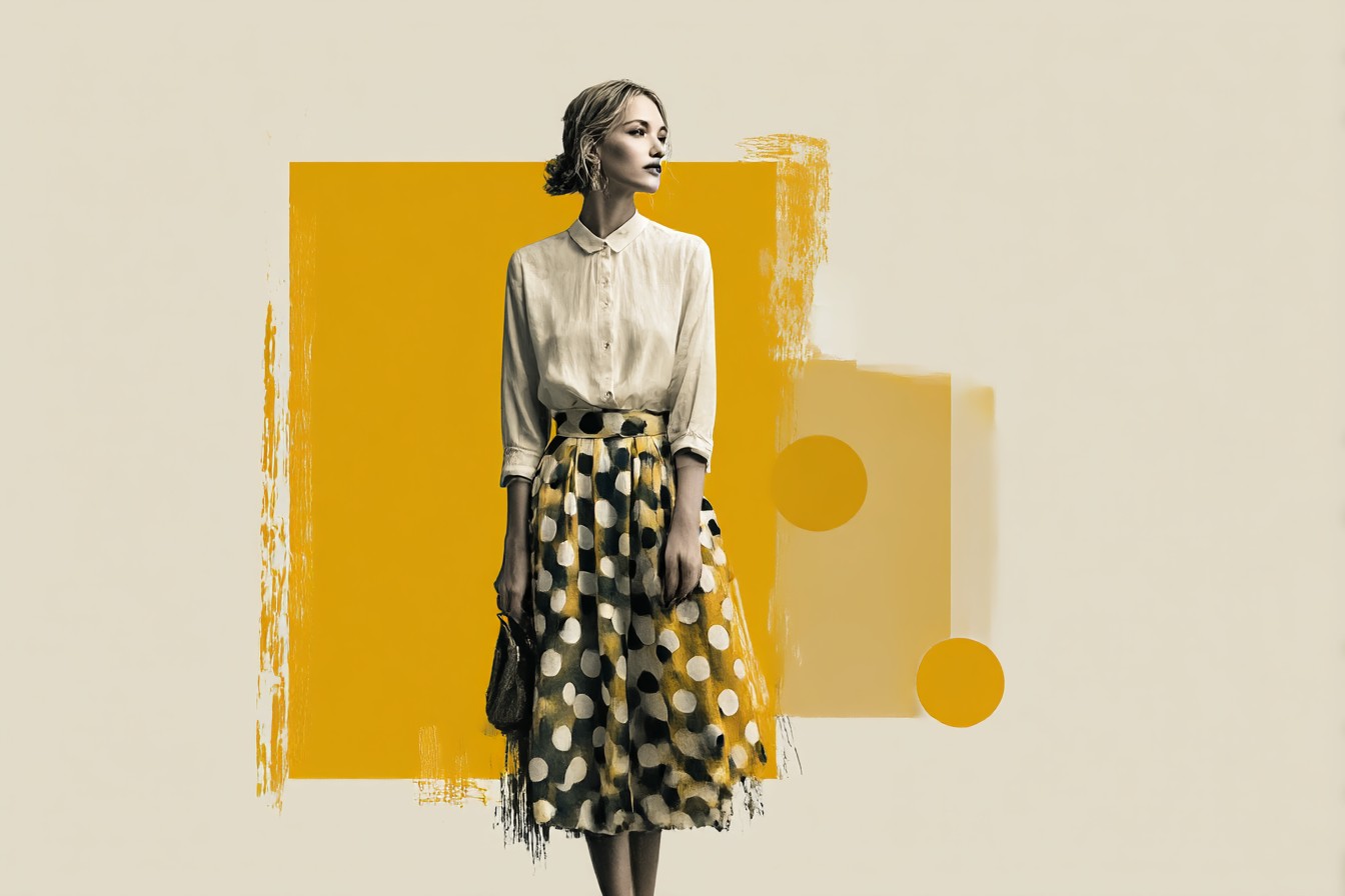
A good polka dot skirt lives or dies on the scale and spacing of the dot. Too small and it reads as texture from a distance, almost a solid colour, which rather defeats the point. Too large and it can tip into costume territory, especially in a stiff fabric that holds the shape away from the body. The ones worth hanging onto tend to sit in the middle: a dot with enough presence to register as pattern across a room, printed on something with a bit of drape, viscose, crepe, a softer cotton blend, so the spots move slightly rather than sitting rigid. That movement is what keeps the print from looking flat or novelty.
Fit matters more than people expect from what looks like a simple print skirt.
A high waist with a proper waistband stops the eye at the smallest point and gives the pattern somewhere to sit without bunching. Bias cut versions swing well and suit a slip of a top, while an A line in a firmer fabric holds its shape through a working day and needs less thinking about.
Length is worth deciding on purpose rather than by accident: midi for something that can move between office and evening, mini for a print that wants to feel younger and more directional, but always with the dot spacing checked at that specific length, since a print that looks balanced on the hanger can bunch oddly once hemmed.
Styling-wise, the instinct to match dot to dot elsewhere on the body is usually the wrong one. A plain, close fitting top in black, cream or a colour lifted straight from the print grounds the pattern rather than competing with it. Knitwear works particularly well against polka dot, the texture contrast does a lot of the styling for you. Footwear can go either way: a loafer or slim boot for daytime, a strappy heel for evening, and the skirt barely needs adjusting between the two.
Occasion-wise, this is a genuinely flexible print rather than one that only comes out for one kind of day. It suits daytime meetings and long lunches just as well as it does a evening out, provided the fabric and length are chosen with that range in mind. Where it struggles is anything too formal or too sombre; polka dot has a naturally cheerful register and fighting that is rarely worth the effort.
Top Picks